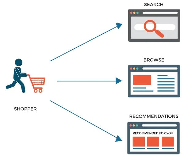
Of the above three paths, shoppers who use site search are highly intent-driven, meaning they know what they are looking for. As a result, they also have the highest potential for conversion.
"Lead them to what they seek."
Many shoppers start their search for products on Google and then navigate to an eCommerce site. But this behavior is beginning to change. Instead, shoppers increasingly use eCommerce sites to search directly for products they intend to buy.
- 55% of shoppers are found to start their product searches on Amazon,
- Nearly 30% of online shoppers use the eCommerce site search box,
- More than 50% of those who use the site search end up placing an order.
While many eCommerce retailers have understood the significance of this and are actively seeking to enhance backend technology for their onsite search (as they rightly should!), most overlook the importance of front-end elements that encourage shoppers to use the site search.
An optimized search interface that offers a personalized and intuitive search experience will achieve high conversion rates and average order values, thus increasing your overall ROI.
Optimizing the search UX for a great search experience
1. Search Box
Shoppers, especially product-focused ones, immediately look for a search box upon opening a website. Your site's search box should be a visually appealing feature. A prominent and visible search box invites the user to locate it quickly. Clarity of presentation of page elements is also part of Search UX
Place the cursor in the search box upon page load. During A/B testing, one large US retailer found that this simple technique significantly increased the frequency of shoppers using the site search
Hide helpful text in the search box when the customer starts typing. You would be surprised that many online retailers overlook this simple and widely practiced technique.
To improve search usability, provide the search box with an adjustable length for long-tail queries.
For easy and immediate access, display the search box on every web page, not only the home page.
2. Autocomplete and Autosuggest
Autocomplete and autosuggest are almost always used interchangeably. But there are subtle differences between them both. Autocomplete resolves a partial query, i.e., as shoppers enter their query in the search box, it predicts the shopper's query.
On the other hand, Autosuggest tries to predict the shopper's intent based on the partial keyword. It then shows multiple products or category options to help the shopper quickly narrow down their real intent. In addition, user-friendly Autocomplete and Autosuggest features assist users in providing accurate search queries.
- Limiting the number of suggestions to fit into the screen size and staying relevant could be challenging. Therefore, provide an optimized expanded list instead of a scrollbar to view all suggestions
- Include images and visuals during autosuggestions. Studies indicate that this improves customer interaction by 70%.
- Have a clear demarcation between top products & categories and individual product suggestions.
Implementing these features with a high accuracy level will shorten shoppers' paths to purchase. For example, shoppers can navigate right from the search box instead of navigating to the search results page and then navigating from there.
3) Facets and Filters
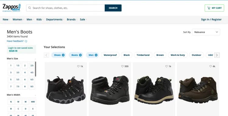
Filters and facets (complex systems that logically group filters) are beneficial to narrow down search results. Using different attributes as facets, such as price, brand, category, product variations, user ratings, and other attributes, helps the shopper drill down quickly to their product choice.
- If there are many attributes in a facet, hide them behind a "view all" or "see more" link to retain a clean design.
- Enable dynamic faceting, i.e., relevant facets that apply to a specific category, to increase relevancy.
- Instead of using static facets, which retain the same filters for different and even unrelated product categories, making them dynamic and specific shortens the purchase time of shoppers.
- Another quick way to increase relevancy is removing filters for zero matches. This also ensures brand trust.
4. Search Results Pages

The displayed results page for a search query should be easily discernible and offer efficient navigation to browse and locate products. It is the most critical part of the Search UX.
- The results page should have a clean and intuitive UI and be relevant
- Add item specifications, a range of available products, and special offers to a simplified and intuitive display to provide easy access
- Provide related product suggestions and cross-sell products
- Zero results pages should be avoided at all costs. Redirect the shopper to a relevant category/subcategory or recommended products.
- Provide a quick view of the product (display product images on an overlay or expand the frame to enlarge the picture) for shoppers to inspect closely instead of directing them to the product page.
- Optimize the results page layout so that it can show different types of products. The structure used to display apparel will not work for displaying electronic devices.
The science behind the display of the results page makes it heavily immersive.
What next?
There are multiple problems to address when you solve shopper intent. First, to turn shoppers into buyers, you have to know what they are searching for, why they are searching for it, and how they are searching for it.
It is understanding how part of it will help you build an intuitive and memorable search experience for shoppers that will increase conversion rates, customer retention, and brand loyalty.
Your site search UX has to be portable across various displays and devices, which comes with varying complexities. Learn more about how Unbxd's Auto Suggest and Site Search can help make your website experience commendable!


