What is a UI for ecommerce Websites?
User Interface (UI) for ecommerce is the visual aspect of any ecommerce application or website that determines how users interact with the information displayed on your application or website. Ecommerce UI covers design thinking theory through user interaction with graphic design, interaction design, and information infrastructure and focuses on improving usability and user experience.
An excellent ecommerce UI enhances the user experience through the fluidity of interaction of various elements on the website, not only with the user but also with each other. UI also refers to what information the user sees when interacting with various elements of an ecommerce website or application. The relevance of information adds to the overall user experience and decides if a user will stay on your website or application.
Website Aesthetics is the key.
The colors and placement of various objects on the website or your app are crucial for delivering a successful user experience. However, in the UI for an ecommerce site, one must not forget how the objects interact, and the expected result of each action is also essential. Therefore, the smoother and more fluid the UI is, the better it is for your ecommerce site and the longer your customers will interact with it.
The simplicity of UI for eCommerce is key to a smooth user experience. Choose a single bold color theme for your ecommerce website and implement its various shades.
Acquire site search capability for both visual and voice
People searching the website are the ones with the highest intent to purchase. It is imperative for ecommerce websites and apps to have all-around search capability, i.e., both voice and visual. It has become increasingly crucial that ecommerce platforms have to focus on both kinds of site search across all devices for a seamless experience.
Develop cross-device capability for your ecommerce platform
A crucial aspect of UI design for ecommerce websites and apps is thumb-friendly mobile navigation. 49.2% of all ecommerce sales are expected to take place on mobile phones by 2021.
When designing your ecommerce site, make sure to put menus, navigation bars, and the all-important purchase buttons within your thumb’s reach. It is worth noting that even SEO for webpages also prioritizes mobile-friendliness, but that does not mean ignoring desktop. Still, desktop users drive the majority of traffic. So it would be a smart idea to optimize for both mobile and desktop users.
Invest in AI and ML capabilities for conversational UI
AI and ML can help devise the most efficient, tailored user experience for ecommerce sites by providing new insight into UI.
In ecommerce platforms, the ability to perform site searches is a priority, therefore developing a deeper understanding of user interaction is vital. AI and ML can help ecommerce platforms understand what drives conversions. With voice and visual site search in place, having AI and ML capability is the cherry on the cake. It will help you understand various conversations that customers have with the ecommerce platform across platforms.
Strategies for excellent UI for ecommerce websites
With such opportunities on the horizon, it is crucial to have the right strategies to get the most out of them. Here are some tips for building an excellent UI for an ecommerce site.
- Make your brand visible to customers
- Keep user flow at the core
- Check if the page is scannable
- Work towards reducing human effort
- Experiment wherever you can but do not stray too much
- Use targeted landing pages
- Make the most of the home page
- Use high-quality images
- Use video clips to explain the information in a better way.
- Make rewards and other benefits more visible so that your website becomes stickier than before
9 examples of great UI for ecommerce websites
Now that you have insight into the strategies required to craft great eCommerce websites with excellent UI offering the best user experience to its customers.
Here are a few examples of how some brands implemented them:
IGK
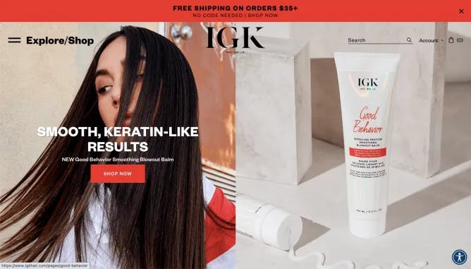
IGK makes excellent use of whitespace to accentuate the visual appeal of its hair care products. Colors are used well to put the brand at the forefront. The copies are spot on, and the designs are clean. The limited animations used to showcase the product only add flavor. IGK also incorporates high-quality images of products and models to add additional appeal to the eCommerce website. The website has been optimized for desktop and mobile devices.
House of ROHL
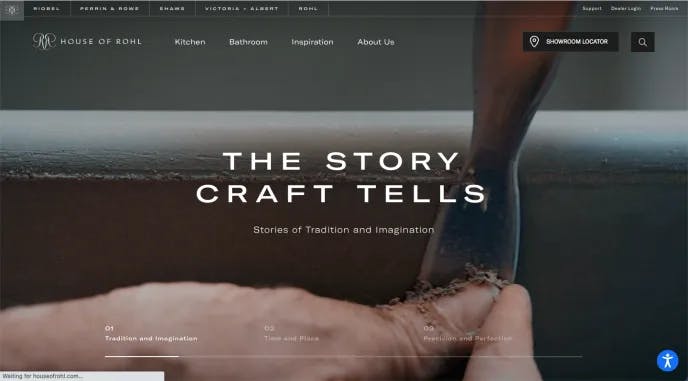
The House of ROHL is a place for vintage-style kitchen and bath fixtures. These fittings are bespoke and handcrafted; it becomes evident from their choice of design, images, and copywriting. The contrast of high-quality pictures with the right background on the ROHL website showcases the craftsmanship behind the fixtures that exudes luxury beautifully.
HiSkin

HiSkin is a skin care brand. The ecommerce website makes excellent use of videos in its minimalist style. The use of videos with people of different ethnic backgrounds is easily understood. This eCommerce website’s UI showcases the use of multiple tones of a single color and video to speak the brand language to its fullest.
Limnia Kasama

Limnia Kasama is a community-based ecommerce platform for upper-class modern women. The choice of fonts, excellent image quality, copywriting, and the proportionate use of white space add to the elegance of the website’s polish. The homepage is highly tailored, with excellent navigation prompting great product discovery. The site search engine is fluid and encourages products based on previous search activities, enabling a great user experience.
GitmanBros
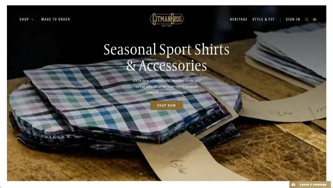
GitmanBros is a bespoke shirt brand. The UI of the ecommerce website is an absolute looker. The brand’s user interface caters to the modern man looking for a classy yet vintage look. The buyer persona they are trying to reach out to is upper-class men interested in sports and related activities. A clean layout with minimal animation makes it even more appealing. In addition, the copywriting of the website is very straightforward, which is appealing to men.
Google Pixel 5
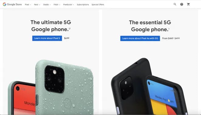
Google Pixel 5 website is something website creators should look up to while creating one. Scrolling through the website is an experience in itself. There are things about the website you cannot ignore when you visit it, including its simplicity and focus on creating an experience for the visitor. The website’s copy is straightforward and focused on the phone’s critical features as the targeted buyer persona is affluent tech-savvy adults.
Haerfest
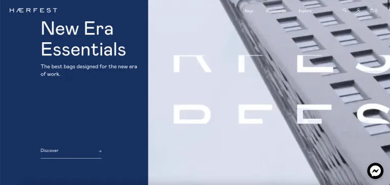
Haerfest’s customers are travelers and office-goers. They all need backpacks that can store a lot in a small space. It should be sturdy and modern at the same time. A minimalist design with excellent copy and the right set of images and videos creates magic. A single CTA on the page is all it takes to get customers to the right place. A more straightforward design fits well with the trendy and exact nature of the product.
Waka Waka
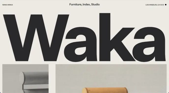
Waka-Waka is distinctive in its UI for ecommerce websites. The large images with random animations go well with the different looks of the furniture. The website is for people searching for something different which is functional, elegant, modern, and experimental. Like its buyer persona, the website stands out with its extra-large fonts and images and use of single-tone color. Like its furniture products, the website is also functional. Waka-waka, however, does so with some elegance.
Nixon
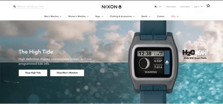
Nixon is the ecommerce site for premium sports watches, apparel, backpacks, and accessories for people who indulged in surfing, skating, and snow sports. There’s something for everyone, from everyday sports & fitness to small digital watches for a night out. Once you land on the website, the UI is very clear about who is the right person to be there. The choice of images and animations is impeccable and demonstrates the functionality and use of the products. Navigating through the website feels divine.
How does Unbxd aid in a great experience through UI for ecommerce websites?
You have gone through all these examples of UI for ecommerce websites. They are beautiful and deliver excellent user experiences in their way. The question now arises what does Unbxd do to improve your eCommerce website UI.
The site search capability of Unbxd uses AI and ML algorithms that track buying behavior and optimizes itself to discover products that customers are willing to buy. Unbxd has an in-depth understanding of the customer.
Unbxd infers the meaning and intent behind each search and delivers to the customer the product they are most likely to buy. It is a win-win situation for customers as well as the ecommerce business. Customers find products faster, thus shortening the customer journey. Ecommerce businesses provide excellent user experiences to customers that increase their revenue and retain customers.


