The UI

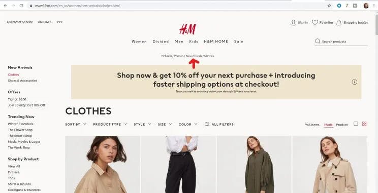
Any website is better judged by its aesthetic look. Yes, we are indeed judging a book by its cover! I mean, of course, the product listings matter, but only after you are convinced about the look and feel of the website do you proceed ahead in your shopping journey. . Almost like when we run into a hotel randomly, the only factor influencing our behavior is how pretty it looks! Even though you haven’t even checked the rooms, your reasoning somewhere fits your agenda.
- In UX design, we call this an Aesthetic usability effect.
- Users often perceive aesthetically pleasing design as a more functional design.
- The second important factor is called the “Gestalt Principle.” The principle stands perfectly aligned with ecommerce sites stating how important it is to place the products in good patterns. For example, putting similar products together, creating a design, replicating a continuity, or displaying proximity.
- The third principle acts on displaying the right colors. Whether it should be pleasant, like green, white, or blue. Add more yellow to reflect a happy vibe, and so on. It is recommended to avoid dark colors as a whole.
When the UI is clearly defined, we define the perfect search bar that ultimately brings the products to the screen.
The perfect search
Now that the UI carpet has been rolled out, we have perfected our search bar. A few techniques, if used wisely, can change the ecommerce experience. And we can’t emphasize this any less!
- Categorize the products: When you are a merchandiser carrying diversified products, you must branch them into respective categories. You have products from the fitness domain, beauty, apparel, and even home accessories. But imagine someone searching for ‘Paints.’ Although they are looking for nail paints, the display page is flooded with home paints and nail paints. Avoid this.
Segregate your products into proper categories to get results for the intended search.
Place the categories on the UI bar.
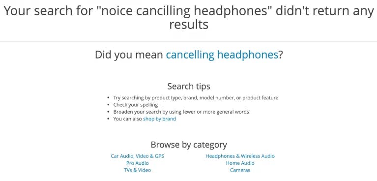
The better the navigation of products, the better the shopper experience is. - Curb zero results: Tired of searching for proper product names and falling into a pit of zero results! URGH!
These customer reviews budge you to make efforts to Add synonyms, provide search term suggestions, add ‘did you mean, and more.
Let the customers know the non-availability of the product they searched for, but also tell them about the closest product (most relatable) to their searched query!
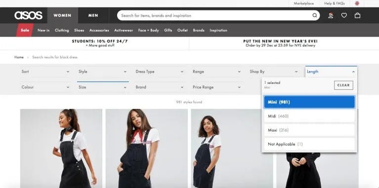
Filter out results: According to Hick’s law, the time a customer takes to make a decision is directly proportional to the number of available choices of products. The more the option, the more time is taken, and the more the chances of indecisiveness and abandoning the cart. So, provide more filters. Brand, Size, Price, etc.
When shoppers can select and filter out options, they feel more clutter-free to order the product.
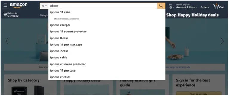
Autocomplete: “Women sh……” and your site provides a list of possible options:
“Women's shoes”
“Women shirts”
“Women shawls”
The shopper immediately selects the first option and leaves for the product display page. This is how easy autocomplete makes a shopper’s journey easier.
The personalization
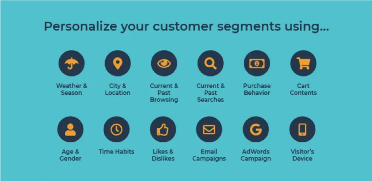
Now, we are sorted in terms of our UI and search bar. But a revenue-generating ecommerce site needs to know its shoppers and their choices better. That’s when personalization enters.
The world is anyway moving toward knowing your audience. Be it social media, digital marketing, or any marketing strategy, it needs more empathy.
To personalize your site, follow the pyramid structure
- Capture user data: Track and monitor every user step that a user takes on your site. The last pages are browsed, products searched, last visit time, or products bought. Capture these data points and give your shoppers the experience in return for these data points.
- Segment your users: Once you know the data points, segregate users based on their choice of products. Android users, iPhone users, Nike lovers, and so on. This way you can recommend products to a particular segment of the user.
- Personalize: After segmenting the users, now it’s time to personalize the entire experience for each customer. Track their chosen products, last searched history, often browsed categories, favorite brands, and saved addresses. Merchandise to show special offers on their favorite products to retain them forever.
The testing & debugging
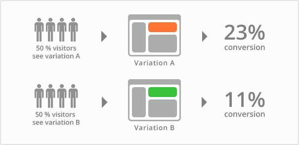
When you apply these changes to your site, you strictly need to test them out. See what’s working and what’s not. A/B testing lets you know if the changes that you made actually brought some value to your revenue. Testing different ranking criteria or product placement ideas helps ecommerce site owners understand which searches are driving the best results, and which searches are underperforming, and adjust accordingly. All of this testing should be done, and with some search as service providers can be done, without hurting the whole website if the newest strategy ends to be less effective.
The analytics
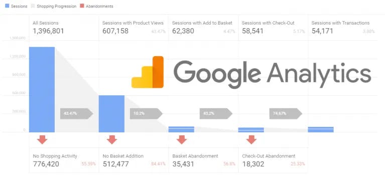
Once the site is ready, track the site insights. Try Site search analytics to help identify the popular products, underperforming products, or the gaps between what users want and what you don’t have. Such insights help you to grow as better merchandisers.
Apply these strategies by yourself: Often termed as the easier path, this in fact needs more resources, strategizing, and development from your side.
Apply these strategies via Unbxd: But when you levy these responsibilities on our shoulders, we take care of your business like our own.


