Breadcrumbs
Table of contents
Definition
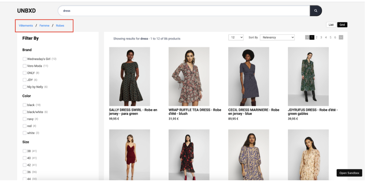
In e-commerce, ‘breadcrumbs’ refer to a navigation element that allows users to see the hierarchical structure of the website and understand their location within the site. They are typically displayed as a series of links that indicate the path that a user has taken to reach the current page.
For example, if a user is on a product page for a specific item, the breadcrumb might show: Home > Clothing > T-shirts > Men’s T-shirts > [Product Name]
This way, the user can easily understand where they are within the website and navigate to other sections of the site.
Breadcrumbs are usually displayed at the top of a page, above the main content area. They can be helpful for users that have landed on a page from a search engine, external link or other website, as it allows them to understand the context of the page and navigate to other related sections.
Additionally, it can help users that are not familiar with the website structure to easily navigate, and also to return to a specific location on the website, by clicking on the breadcrumb links.
Breadcrumbs can also be used to highlight the relevance of the product or category that user is currently browsing in the website.
Behavior
To render the breadcrumb component, set the “breadcrumb” config object.
Configurations
To render the breadcrumbs on the search results page, you can use the breadcrumbs config object to configure the various options.
breadcrumb: {
    //Below configurations should be added here.
}
The following options are available under the breadcrumb:
enabled
Boolean
An “enabled” option in breadcrumbs within an SDK refers to the ability to use the breadcrumb navigation feature. When the breadcrumb is enabled, it will be visible and they will be able to use it to navigate through the different components and features of the SDK. On the other hand, if the breadcrumb is disabled, it will not be visible to the developer and they will not be able to use it to navigate through the SDK.
Default Value
enabled: true
Scenarios
true- Breadcrumbs will be displayed on the website.false- The breadcrumb feature will be disabled .
el
Element
Required
“el” is an HTML element that is designated to display breadcrumbs. This allows developers to control the placement of the breadcrumb on the webpage and to ensure that they are displayed in a prominent and visible location. The “el” can be set by providing the id or class of the element in the code.
Default Value
el: null
Scenarios
There are several HTML selectors that can be used to locate the banner element in an e-commerce page. For ex: getElementById, getElementsByClassName, getElementsByTagName, querySelector, querySelectorAll, getElementsByName, etc.
template
Function
The “template” function here refers to the ability to change the look and feel of the breadcrumb feature . The function receives the list of breadcrumbs to be displayed , and the breadcrumb configurations as parameters and return a string of HTML to render the breadcrumb on to the webpage .
This function passes two params:
breadcrumbs- the list of breadcrumbs to be displayedbreadcrumb- the breadcrumb configurations
Expected return value: a string of HTML that will be used to render the breadcrumbs on the webpage
Default Value
template: function(breadcrumbs, breadcrumb){
    let ui = ``;
    const {
        selectorClass
    } = breadcrumb;
    breadcrumbs.forEach((item ,id )=> {
        const {
            level,
            filterField,
            value
        } = item;
        const css = `${selectorClass} UNX-bread-crumb-item`;
        if(id > 0) {
            ui += `<span class="UNX-slash"> / </span>`;
        }
        ui += [`<button data-parent="${filterField}" data-level="${level}" class="${css}" data-name="${value}" data-action = "clearCategoryFilter">`,
        `${decodeURIComponent(value)}</button>`].join('')
    })
    return `<div class="bread-crumb-main">${ui}</div>`
}
Scenarios
For additional information on custom scenarios, please refer to the use cases section located below.
selectorClass
String
The “selectorClass” option in breadcrumbs is an additional css class that can be used to identify and style the breadcrumb navigation. User can choose to either use default value or override it with a new custom class name .
Default Value
selectorClass: "UNX-bread-crumb"
Scenarios
Any valid class name can be passed as a selector class name.
tagName
String
“tagName” refers to the name of an HTML tag used to wrap or structure the content (spellcheck) on a webpage.
Default Value
tagName: "div"
Scenarios
Any valid html tag such as div, span, p, h1, h2, etc in which you like the banner code to be wrapped in.
htmlAttributes
Object
“htmlAttributes” refers to a set of key-value pairs that provide additional information or properties for an HTML element. By default it contains classes for the wrapper. You can add more classes or any valid attributes.
Default Value
{
    class: ”UNX-breadcrumbs-block”
}
Scenarios
Any valid html attribute can be passed as key : value pairs inside an object.
Usecases
Usecase 1 : Default Example
User requirement

breadcrumb:{
  enabled:true,
  el: document.getElementById("breadcrumpContainer"),
  selectorClass:"UNX-bread-crumb",
  template:function(breadcrumbs, breadcrumb){
    let ui = ``;
    const {
        selectorClass
    } = breadcrumb;
    breadcrumbs.forEach((item ,id )=> {
        const {
            level,
            filterField,
            value
        } = item;
        const css = `${selectorClass} UNX-bread-crumb-item`;
        if(id > 0) {
            ui += `<span class="UNX-slash"> to </span>`;
        }
        ui += [`<button data-parent="${filterField}" data-level="${level}" class="${css}" data-name="${value}" data-action = "clearCategoryFilter">`,
        `${decodeURIComponent(value)}</button>`].join('')
    })
    return `<div class="bread-crumb-main">${ui}</div>`
  }
}