Facets
Table of contents
- Definition
- Behavior
- Types of Facets
- Configurations
- facetsEl
- facetTemplate
- facetItemTemplate
- facetMultiSelect
- facetClass
- facetAction
- selectedFacetClass
- selectedFacetsEl
- selectedFacetTemplate
- selectedFacetItemTemplate
- selectedFacetConfig
- clearAllText
- rangeTemplate
- rangeWidgetConfig
- facetMultilevel
- facetMultilevelName
- multiLevelFacetSelectorClass
- multiLevelFacetTemplate
- facetDepth
- clearFacetsSelectorClass
- removeFacetsSelectorClass
- onFacetLoad
- applyMultipleFilters
- applyButtonText
- clearButtonText
- isCollapsible
- defaultOpen
- isSearchable
- searchPlaceHolder
- enableViewMore
- viewMoreText
- viewMoreLimit
- tagName
- htmlAttributes
- actionBtnClass
- actionChangeClass
- Data actions
- UseCases
- Usecase 1 : Default Example
- Usecase 2: Range Sliders
- Usecase 3: Checkable Range Facets
- Usecase 4: Facets with collapsible, searchable, view more and default open
- Usecase 5: Custom facet template with color swatches
- Usecase 6: Facet item with swatches in the name
- Usecase 7: Customized facet block
- Usecase 8: Customized selected facets
- FAQs
Definition
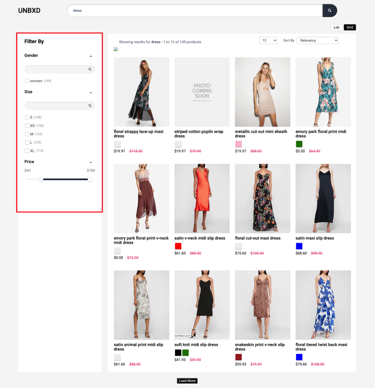
In e-commerce, facets (also known as filters or attributes) are a way to allow customers to narrow down their search results by selecting specific criteria. Facets are typically displayed on the left or right side of a search results page, and can include options such as price range, brand, color, size, and more. They allow customers to quickly and easily find the products they are looking for by narrowing down the options based on their specific needs and preferences.
For example, an e-commerce website for clothing would have facets such as Size, Color, Material, Brand, Gender and so on. By selecting options from the available facets, customers can narrow down the search results to only show products that match the criteria they’ve selected. This can make it easier for customers to find the specific products they’re looking for, and can also increase the chances that they’ll make a purchase.
Behavior
Facets are the products filters provided on your webpage which allows customers to narrow down the search result set.
Types of Facets
In e-commerce, facets are used to allow users to filter and narrow down a large dataset of products by specific criteria. There are several types of facets that can be used to achieve this, including:
Multilevel facets: These are facets that allow users to filter products based on multiple levels of a category hierarchy. For example, a user could filter products first by category (e.g. clothing, electronics) and then by subcategory (e.g. men’s clothing, women’s clothing).
Text facets: These are facets that allow users to filter products based on text fields, such as product name or brand. For example, a user could search for all products that contain the word “Nike” in their name.
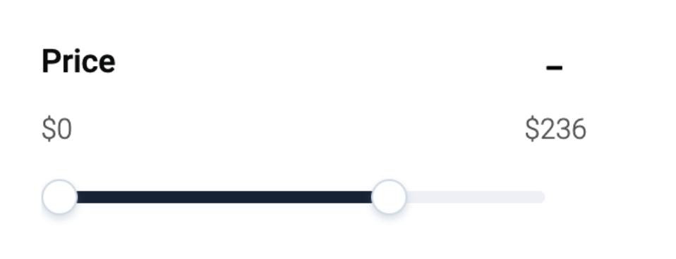
Range facets: These are facets that allow users to filter products based on a range of values. For example, a user could filter products by price range, so they only see products that fall within a specific price range. This type of facet is commonly used to filter products based on numeric values such as price, weight, size, etc.
Configurations
To render the facets on the search results page, you can use the “facet” config object to configure the various options.
facet: {
    //Below configurations should be added here.
}
The following options are available under the object:
facetsEl
Element
Required
Element in which to render the facets.
“facetsEl” in facets is an HTML element that is designated to display facets. This allows developers to control the placement of the facets on the webpage and to ensure that they are displayed in a prominent and visible location. The “facetsEl” can be set by providing the id or class of the element in the code.
Default Value
facetsEl: null
Scenarios
There are several HTML selectors that can be used to locate the banner element in an e-commerce page. For ex: getElementById, getElementsByClassName, getElementsByTagName, querySelector, querySelectorAll, getElementsByName, etc.
facetTemplate
Function
Customize the look and feel of the facets block by returning your custom HTML string from this function. This function accepts following parameters:
facetObj: the facet obj is received herechildren: the html string blockisExpanded: is expanded flag (in case you have chosen collapsible facets, i.e. isCollapsible is set to true)facetSearchTxt: the search text entered for this facet block (if isSearchable is set to true)facet: the complete configs for facets.
Expected Return Value : A string of HTML that will be used to render the facet block on the webpage.
Default Value
facetTemplate: function(facetObj, children, isExpanded,facetSearchTxt, facet) {
        const {
            displayName,
            facetName,
            multiLevelField,
            facetType,
            values
        } = facetObj;
        const {
            facetClass,
            applyMultipleFilters,
            isCollapsible,
            isSearchable,
            searchPlaceHolder,
            textFacetWrapper,
            enableViewMore,
            viewMoreText,
            viewMoreLimit,

            applyButtonText,
            clearButtonText,

        } = facet;
        const {
            actionBtnClass,
            actionChangeClass
        } = this.options;
        const {
            openBtn,
            closeBtn
        } = this.cssList;
        let viewMoreUi = ``;
        let viewMoreCss=``;
        const selected = this.getSelectedFacets()[facetName];
        const isFtr = (selected && selected.length >0)?true:false;
        if(enableViewMore && facetType==="text" && values.length > viewMoreLimit ) {
            viewMoreCss="UNX-view-more";
            viewMoreUi = `<div class="UNX-view-more-row "><button class="${actionBtnClass}" data-facet-name="${facetName}" data-action="viewMore" data-id="${viewMoreText[0]}">${viewMoreText[0]}</button></div>`;
        }
        let clearUI = ``;
        let applyBtn = ``;
        if(isFtr){
            clearUI = `<button class="UNX-facet-clear ${facetClass} "data-facet-action="deleteFacet" data-facet-name="${facetName}">${clearButtonText}</button>`;
        }
        if(applyMultipleFilters && isFtr) {
            applyBtn = `<button class="UNX-facet-primary ${facetClass} "data-facet-action="applyFacets" >${applyButtonText}</button>`
        }
        let collapsibleUI = ``;
        let searchInput = ``;
        if(isCollapsible){
            if(isExpanded) {
                collapsibleUI = `<button class="UNX-collapse-btn ${openBtn} ${actionBtnClass}" data-facet-name="${facetName}" data-facet-action="facetClose"></button>`
            } else {
                collapsibleUI = `<button class="UNX-collapse-btn ${closeBtn} ${actionBtnClass}" data-facet-name="${facetName}" data-facet-action="facetOpen"></button>`
            }
        }
        if(isSearchable && facetSearchTxt !== null) {
            searchInput =`<div class="UNX-searchable-facets"><input data-test-id="${this.testIds.UNX_searchFacets}" class="UNX-facet-search ${actionChangeClass}" value="${facetSearchTxt}"  data-facet-name="${facetName}" data-facet-action="searchFacets" type="text" placeholder="${searchPlaceHolder}"/></div>`
        }
        return [`<div class="UNX-text-facet-wrap">`,
                    `<div class="UNX-facet-header"> <h3>${displayName}</h3> ${collapsibleUI}</div>`,
                    `<div class="UNX-facets-all">`,
                        searchInput,
                        `<div class="UNX-facets ${textFacetWrapper} ${viewMoreCss}">${children}</div>`,
                        viewMoreUi,
                        `<div class="UNX-facet-footer">${applyBtn} ${clearUI}</div>`,
                    `</div>`,
               `</div>`].join('');
    }
Scenarios
For additional information on custom scenarios, please refer to the use cases section located below.
facetItemTemplate
Function
Customize each individual facet value by returning your custom HTML string from this function.
This function expects 3 parameters:
facet: the complete facet block.value: the current facet value.facetSearchTxt: the search text entered for this facet block.
Expected Return Value : A string of HTML that will be used to render the facet block on the webpage.
Default Value
facetItemTemplate: function facetItemUiElem (facet , value,facetSearchTxt) {
    const {
        facetName,
        isSelected
    } = facet;
    const  {
        name,
        count,
        dataId
    } = value;
    let {
        facetClass,
        selectedFacetClass
    } = this.options.facet;
    const {
        UNX_uFilter
    } = this.testIds;
    if(facetSearchTxt && facetSearchTxt.length > 0) {
        if(name.toUpperCase().indexOf(facetSearchTxt.toUpperCase()) < 0 ){
            facetClass +=' UNX-search-hidden'
        }
    }
    let action =  "changeFacet";
    if(isSelected) {
        facetClass += ` ${selectedFacetClass}`
        action = "deleteFacetValue";
    }
    return [`<button data-test-id="${UNX_uFilter}" data-facet-name="${facetName}" data-facet-action="${action}" class="UNX-change-facet ${facetClass}" data-id="${dataId}">`,
                `<span class="UNX-facet-text">${name}</span> <span class="UNX-facet-count">(${count})</span>`,
            `</button>`].join('');
}
Scenarios
For additional information on custom scenarios, please refer to the use cases section located below.
facetMultiSelect
Boolean
“facetMultiSelect” allows a user to select multiple values within a single facet . When turned on , the user can select multiple values and the search results will be filtered to only show items that match all of the selected facets. Turn this off if you want to disable the multiple selection of facets.
Default Value
facetMultiSelect: true
Scenarios
true- enable the multiple selection of facetsfalse- disable the multiple selection of facets
facetClass
String
Additional CSS class name to add to the the facet items.
Default Value
facetClass: “UNX-facets-block”
Scenarios
Any valid class name can be added here as facetClass.
Important: Avoid overriding the UNX-change-facet class. If you must customize it, ensure you include the following CSS rule to maintain proper facet selection functionality:
.UNX-change-facet * {
    pointer-events: none;
}
Why this is needed: This CSS rule ensures that clicks on child elements (like spans, divs, or text) within facet buttons are properly handled by the parent button element, preventing facet selection issues.
facetAction
String
Event based on which to trigger facet selection / deselection.
Default Value
facetAction: 'click'
Scenarios
Click: selection / deselection happens when the user clicks on a specific button or any other element .Change: change refers to a operation that is initiated when a specific variable or data element is changed
selectedFacetClass
String
Additional CSS class name for the selected facet items.
Default Value
selectedFacetClass: “UNX-selected-facet-btn"
Scenarios
Any valid class name can be added as selectedFacetClass.
selectedFacetsEl
Element
“selectedFacetsEl” is a config that specifies the HTML element where selected facets will be displayed. The selectedFacetsEl property is used to specify a container element, such as a div, that will be used to display the selected facets. If you don’t provide this element selected facets will be rendered along with the facet blocks.
Default Value
selectedFacetsEl: null
Scenarios
There are several HTML selectors that can be used to locate the banner element in an e-commerce page. For ex: getElementById, getElementsByClassName, getElementsByTagName, querySelector, querySelectorAll, getElementsByName, etc.
selectedFacetTemplate
Function
Customize the look & feel of the selected facets block by returning your custom HTML string from this function.
This function receives following parameters:
selections: the complete html for selected facets block.facet: the facets configs.selectedFacetsConfig: the selectedFacet configs .
Expected Return Value : A html string is returned .
Default Value
selectedFacetTemplate: function selectedFacetUI(selections, facet,selectedFacetsConfig) {
    const {
        clearAllText,
        clearFacetsSelectorClass
    } = facet;
    const selectedFClass = (this.selectedFacetClass)?this.selectedFacetClass:selectedFacetsConfig.selectedFacetClass;
    if(selections.length > 0) {
        return [`<div class="UNX-facets-selections">`,
            `<h5 class="UNX-selected-facet-header">Selected Filters</h5>`,
            `<div class="UNX-selected-facets-inner">${selections}</div>`,
            `<button class="${clearFacetsSelectorClass} ${selectedFClass}" data-facet-action="clearAllFacets">${clearAllText}</button>`,
       `</div>`].join('');
    } else {
        return ``;
    }
}
Scenarios
For additional information on custom scenarios, please refer to the use cases section located below.
selectedFacetItemTemplate
Function
Customize the look & feel of the selected facet by returning your custom HTML string from this function. This function expects following parameters:
selectedFacet: the selected facet block information like facetName , facetType etc.selectedFacetItem: the value of selected facet for eg: name , dataId , count etc.facetConfig: the complete block of facets configs.selectedFacetsConfig: the configs for selected block of facets.
Expected return value :
Default Value
selectedFacetItemTemplate: function selectedFacetItemTemplateUI (selectedFacet, selectedFacetItem, facetConfig, selectedFacetsConfig){
    const {
        facetName,
        facetType
    } = selectedFacet;
    const  {
        name,
        count,
        dataId
    } = selectedFacetItem;
    const {
        facetClass,
        selectedFacetClass,
        removeFacetsSelectorClass
    } = this.options.facet;
    const {
        UNX_uFilter
    } = this.testIds;
    let action = "deleteSelectedFacetValue"
    if(facetType === "range") {
        action = "deleteSelectedRange"
    }
    const css = ` ${facetClass} ${selectedFacetClass} `;
    return [`<div class="UNX-selected-facets-wrap">`,
                `<button data-test-id="${UNX_uFilter}" class="UNX-selected-facet-btn UNX-change-facet ${css}" data-facet-name="${facetName}" data-facet-action="${action}" data-id="${dataId}">`,
                    `<span class="UNX-facet-text">${name}</span> <span class="UNX-facet-count">(${count})</span>`,
                `</button>`,
                `<button class="UNX-delete-facet ${removeFacetsSelectorClass} ${css}" data-id="${dataId}" data-facet-action="${action}" data-facet-name="${facetName}">x</button></div>`
            ].join('');
}
Scenarios
For additional information on custom scenarios, please refer to the use cases section located below.
selectedFacetConfig
Object
Object will be containing the configuration for the selected facet wrapper config.
Default Value
selectedFacetConfig:{
    tagName: ”DIV”,
    htmlAttributes:{
        class: ”UNX-selected-facet-lb”
        },
        events:{}
}
clearAllText
String
The text to show for the clear all button that clears all selected facets.
Default Value
clearAllText: “Clear All”
Scenarios
Any button name text can be given here.
rangeTemplate
Function
Customize the look and feel of the range facets by returning your custom HTML string from this function. This function expects following parameters:
range: the list of range facets available.selectedRange: the selected rangesfacet: the complete facet block
Default Value
rangeTemplate: function(range, selectedRange, facet) {
    const {
        facetName,
        values,
      } = range;
      let valueUI = ``;
      const {
        facetClass,
        selectedFacetClass,
        applyMultipleFilters,
        applyButtonText,
            clearButtonText,
      } = facet;
      const selected = selectedRange.length > 0 ? true :false;
      values.forEach(item =>{
          const {
            from,
            end
          } = item;
        const isSelected = this.isSelectedRange(facetName,item);
        const btnCss = (isSelected) ? `UNX-selected-facet-btn ${facetClass} ${selectedFacetClass}`:`${facetClass}`;
        valueUI +=[`<button class="${btnCss} UNX-range-facet UNX-change-facet" data-action="setRange" data-facet-name="${facetName}" data-start="${from.dataId}" data-end="${end.dataId}" >`,
            `<span class="UNX-facet-text">${from.name}  -  ${end.name}</span>`,
            `<span class="UNX-facet-count">(${from.count})</span>`,
      `</button>`].join('');
      });
      let clearBtn = ``;
        let applyBtn = ``;
        if(selected) {
            if(applyMultipleFilters) {
                applyBtn = `<button class="UNX-default-btn ${facetClass} UNX-facet-primary" data-action="applyRange"> ${applyButtonText}</button>`;
            }
            clearBtn = `<button class="UNX-default-btn UNX-facet-clear  ${facetClass}" data-action="clearRangeFacets">${clearButtonText}</button>`;
        }
    return [`<div class="UNX-range-wrapper">`,
        valueUI,
        `<div class="UNX-price-action-row">`,
            applyBtn,clearBtn,
        `<div>`,
      `</div>`].join('')
};
Scenarios
For additional information on custom scenarios, please refer to the use cases section located below.
rangeWidgetConfig
Object
Configure the default range slider. Refer to the Range Widget Config section below to view the detailed configs
Default Value
rangeWidgetConfig: null
facetMultilevel
Boolean
Turn this on to send the multilevel parameter in the search API.
Default Value
facetMultilevel: true
Scenarios
true: When turned on , the multilevel parameter will be sent to API.false: When turned off , the multilevel parameter will not be sent in the API.
facetMultilevelName
String
Set the multilevel field name using this config.
Default Value
facetMultilevelName: “Category”
multiLevelFacetSelectorClass
String
Class name for each multi level facet item.
Default Value
multiLevelFacetSelectorClass: “UNX-multilevel-facet”
Scenarios
Any valid class name can given here.
multiLevelFacetTemplate
Function
Customize the look and feel of multi level facets by returning your custom HTML string from this function. This function expects following parameters:
facet:selectedCategories:facetSearchTxt: the search text entered for this facet block (if isSearchable is set to true).facetConfig:
Expected return value: A html string is returned.
Default Value
multiLevelFacetTemplate: function(facet,selectedCategories,facetSearchTxt, facetConfig) {
    let ui = "";
    let {
        multiLevelFacetSelectorClass,
        facetClass
    } = facetConfig;
    const {
        UNX_facetLevel
    } = this.testIds;
    if(selectedCategories) {
        selectedCategories.forEach(item => {
            const {
                level,
                filterField,
                value
            } = item;
            let lTid = `data-test-id="${UNX_facetLevel}${level}"`;
            const levelCss = `${multiLevelFacetSelectorClass}  UNX-category-level-${level}`
            ui += [`<button ${lTid} data-parent="${filterField}" data-level="${level}" data-name="${value}"`,
            `class=" ${levelCss} UNX-selected-crumb ${facetClass}" data-action = "clearCategoryFilter">`,
                `<span class="UNX-category-icon"></span><label class="UNX-facet-text">${decodeURIComponent(value)}</label>`,
            `</button>`].join('')
        })
    }
    const {
        level,
        displayName,
        values,
        filterField
    } = facet;
    let {
        multiLevelField
    } = facet;
    if (!multiLevelField) {
        multiLevelField = filterField;
    }
    let lTid = `data-test-id="${UNX_facetLevel}${level}"`;
    let levelCss = `UNX-category-level-${level}`;
    const valueUI = values.map(item => {
        const {
            name,
            count,
            dataId
        } = item;
        if(facetSearchTxt && facetSearchTxt.length > 0) {
            if(name.toUpperCase().indexOf(facetSearchTxt.toUpperCase()) < 0 ){
                facetClass +=' UNX-search-hidden'
            }
        }
        return [`<button ${lTid} data-parent="${multiLevelField}" data-level="${level}"`,
            `class="${multiLevelFacetSelectorClass} ${levelCss} ${facetClass}" data-name="${dataId}" data-action = "setCategoryFilter">`,
            `<label class="UNX-facet-text">${name}</label><label class="UNX-facet-count">(${count})</label></button>`].join('')
    })
    ui += `<div class="UNX-category-values">${valueUI.join('')}</div>`
    if(ui !== "") {
        return [`<div class="UNX-multi-facet-wrap">`,
            `${ui}</div>`].join('')

    } else {
        return "";
    }
}
Scenarios
For additional information on custom scenarios, please refer to the use cases section located below.
facetDepth
Number
The “facetDepth” configures how many levels of category filter you want to have by setting this value.
Default Value
facetDepth: 4
Scenarios
Any positive integer can be given here.
clearFacetsSelectorClass
String
Class name for the button to clear the selected facets.
Default Value
clearFacetsSelectorClass: “UNX-clear-facet”
Scenarios
Any valid class name can be given here.
removeFacetsSelectorClass
String
Class name for the button to delete selected facets.
Default Value
removeFacetsSelectorClass: “UNX-remove-facet”
Scenarios
Any valid class name can be given here.
onFacetLoad
Function
“onFacetLoad” is a Callback function that gets called after each facet selection or deselection. This function accepts following as a parameter:
onFacetLoad: receives all the facets .
Default Value
onFacetLoad: function(facets) {}
Scenarios
applyMultipleFilters
Boolean
“applyMultipleFilters” enables a user to apply multiple filters together.
Default Value
applyMultipleFilters: false
Scenarios
true: When turned on , multiple filter can be applied together.false: When turned off , multiple filters cannot be applied at once.
applyButtonText
String
The text to show for the apply button .
applyMultipleFilters needs to be set to true for this to work.
Default Value
applyButtonText:“Apply”
Scenarios
Any valid text for a button name can be added here.
clearButtonText
String
The text to show for the clear button.
applyMultipleFilters needs to be set to true for this to work.
Default Value
clearButtonText: “clear”
Scenarios
Any valid text for a button name can be added here.
isCollapsible
Boolean
“isCollapsible” is a flag which can make accordian in each facet block collapsible or non-collapsible.
Default Value
isCollapsible: true
Scenarios
true: The facets block accordion will be collapisible.false: The facets block accordion will not be collapisible.
defaultOpen
String
When “isCollapsible” is true , “defaultOpen” option is used to specify which facets should be expanded or open by default when the search interface is first displayed to the user.
Default Value
defaultOpen: “ALL”
Scenarios
ALL: All of the facets block will be open by default.FIRST: Only the first facet block will be open by default.NONE: None of the facet block will be open by default.
isSearchable
Boolean
Turn this on if you want to have search feature for each facet block.
Default Value
isSearchable: true
Scenarios
true: When turned to , for each of the facets search input will be availble.false: When turned off the search input won’t be availble in facets.
searchPlaceHolder
String
“searchPlaceHolder” defines the placeholder text for the facet search input.
Default Value
searchPlaceHolder: ””
Scenarios
Any valid placeholder text can be added here.
enableViewMore
Boolean
The “enableViewMore” option is used to control whether or not the user can view more options within a particular facet. If this option is enabled, the user will be able to see a “View More” button or link that allows them to expand the facet and see additional options. If this option is disabled, the user will not see the option to expan the facets options.
Default Value
enableViewMore: false
Scenarios
true: If this option is enabled, the button or link to expand / minimize the facets will be available.false: If this option is disabled, the user will not be able to expand / minimize the facet options.
viewMoreText
Array
The text to show for the view more / less button. This accepts an array with two strings in following format :
[<viewMoreText>, <viewLessText>]
Default Value
viewMoreText: [“show all”, “show less”]
Scenarios
Arrays with any two valid strings for button text can be passed here . For eg : [“view more”,”view less”] etc.
viewMoreLimit
Number
The “viewMoreLimit” option is used to specify the maximum number of options that should be displayed within a particular facet before the “View More” button or link is shown. If the number of options within the facet exceeds this limit, only the first “viewMoreLimit” options will be displayed, and the user will need to click the “View More” button to see the remaining options.
Default Value
viewMoreLimit: 3
Scenarios
Any positive integer value can be given here.
tagName
String
“tagName” refers to the name of an HTML tag used to wrap or structure the content on a webpage.
Default Value
tagName: “DIV”
Scenarios
Any valid html tag such as div, span, p, h1, h2, etc in which you like the banner code to be wrapped in.
htmlAttributes
Object
“htmlAttributes” refers to a set of key-value pairs that provide additional information or properties for an HTML element. By default it contains classes for the wrapper. You can add more classes or any valid attributes.
Default Value
htmlAttributes: { class:”UNX-facets-results-block” }
Scenarios
Any valid html attribute can be passed as key : value pairs inside an object.
actionBtnClass
String
CSS class name to add to any facet wrapper elements on which you want to trigger click event.
Default Value
actionBtnClass:"UNX-action-item"
Scenarios
It is used to bind ‘click’ event to a facet wrapper element
Note: Please note this config is available as part of facet config from sdk version
2.1.5. Versions below this it is available as a seperate config here.
actionChangeClass
String
CSS class name to be added to any facet wrapper elements on which you want to trigger change, or keyup event.
Default Value
actionChangeClass:"UNX-action-change"
Scenarios
It is used to bind ‘change’ or ‘keyup’ event to a facet wrapper element
Note: Please note this config is available as part of facet config from sdk version
2.1.5. Versions below this it is available as a seperate config here.
Data actions
data-action
The actions defined below needs to be passed as a data-action attribute.
viewLess- When enableViewMore is true ,this action is needed on the element which on click will show less facet values.viewMore- When enableViewMore is true , this action is needed on the element which on click will show all facet values.setRange- Action is needed on the facet values which are range facet.applyRange- Action is needed on the element which on click will select multiple range facet values at once . (when applyMultipleFilters is true.)setCategoryFilter- Action is needed on the category facet values .clearCategoryFilter- Action is needed on the element which on click will remove the selected category filter.clearRangeFacets- Action is needed on the element which on click removes all selected range facets.
facet-action
The actions defined below needs to be passed as a data-facet-action attribute.
searchFacets- Action is needed on the element in which we need to search for the facet values.changeFacet- Action is needed on the facet values which are either text facets.facetOpen- Action is needed on the element which on click will expand the facets dropdown.facetClose- Action is needed on the element which on click will collapse the facets dropdown.applyFacets- Action is needed on the button which on click will apply the facets (When applyMultipleFilters is true.)deleteSelectedRange- Action is needed on the element (selected facet) , where on click it should remove the selected range .deleteFacet- Action is needed on the button which on click will at once remove all the selected facet values for that one facet .deleteFacetValue- Action is needed on the facet values element , when it needs to be delselected.deleteSelectedFacetValue- Action is needed on the element (selected facet) which on click will remove that selected facet.clearAllFacets- Action is needed on the element which on click removes all the selected facets .clearPriceRange- This action removes a particular range facet from the state and gets new results.
UseCases
Usecase 1 : Default Example
facet: {
    facetsEl: document.getElementById("facetsWrapper"),,
    facetTemplate:function(facetObj, children, isExpanded,facetSearchTxt, facet) {
        const {
            displayName,
            facetName,
            multiLevelField,
            facetType,
            values
        } = facetObj;
        const {
            facetClass,
            applyMultipleFilters,
            isCollapsible,
            isSearchable,
            searchPlaceHolder,
            textFacetWrapper,
            enableViewMore,
            viewMoreText,
            viewMoreLimit,

            applyButtonText,
            clearButtonText,

        } = facet;
        const {
            actionBtnClass,
            actionChangeClass
        } = this.options;
        const {
            openBtn,
            closeBtn
        } = this.cssList;
        let viewMoreUi = ``;
        let viewMoreCss=``;
        const selected = this.getSelectedFacets()[facetName];
        const isFtr = (selected && selected.length >0)?true:false;
        if(enableViewMore && facetType==="text" && values.length > viewMoreLimit ) {
            viewMoreCss="UNX-view-more";
            viewMoreUi = `<div class="UNX-view-more-row "><button class="${actionBtnClass}" data-facet-name="${facetName}" data-action="viewMore" data-id="${viewMoreText[0]}">${viewMoreText[0]}</button></div>`;
        }
        let clearUI = ``;
        let applyBtn = ``;
        if(isFtr){
            clearUI = `<button class="UNX-facet-clear ${facetClass} "data-facet-action="deleteFacet" data-facet-name="${facetName}">${clearButtonText}</button>`;
        }
        if(applyMultipleFilters && isFtr) {
            applyBtn = `<button class="UNX-facet-primary ${facetClass} "data-facet-action="applyFacets" >${applyButtonText}</button>`
        }
        let collapsibleUI = ``;
        let searchInput = ``;
        if(isCollapsible){
            if(isExpanded) {
                collapsibleUI = `<button class="UNX-collapse-btn ${openBtn} ${actionBtnClass}" data-facet-name="${facetName}" data-facet-action="facetClose"></button>`
            } else {
                collapsibleUI = `<button class="UNX-collapse-btn ${closeBtn} ${actionBtnClass}" data-facet-name="${facetName}" data-facet-action="facetOpen"></button>`
            }
        }
        if(isSearchable && facetSearchTxt !== null) {
            searchInput =`<div class="UNX-searchable-facets"><input data-test-id="${this.testIds.UNX_searchFacets}" class="UNX-facet-search ${actionChangeClass}" value="${facetSearchTxt}"  data-facet-name="${facetName}" data-facet-action="searchFacets" type="text" placeholder="${searchPlaceHolder}"/></div>`
        }
        return [`<div class="UNX-text-facet-wrap">`,
                    `<div class="UNX-facet-header"> <h3>${displayName}</h3> ${collapsibleUI}</div>`,
                    `<div class="UNX-facets-all">`,
                        searchInput,
                        `<div class="UNX-facets ${textFacetWrapper} ${viewMoreCss}">${children}</div>`,
                        viewMoreUi,
                        `<div class="UNX-facet-footer">${applyBtn} ${clearUI}</div>`,
                    `</div>`,
               `</div>`].join('');
    },
    facetItemTemplate:function(facet , value,facetSearchTxt) {
        const {
            facetName,
            isSelected
        } = facet;
        const  {
            name,
            count,
            dataId
        } = value;
        let {
            facetClass,
            selectedFacetClass
        } = this.options.facet;
        const {
            UNX_uFilter
        } = this.testIds;
        if(facetSearchTxt && facetSearchTxt.length > 0) {
            if(name.toUpperCase().indexOf(facetSearchTxt.toUpperCase()) < 0 ){
                facetClass +=' UNX-search-hidden'
            }
        }
        let action =  "changeFacet";
        if(isSelected) {
            facetClass += ` ${selectedFacetClass}`
            action = "deleteFacetValue";
        }
        return [`<button data-test-id="${UNX_uFilter}" data-facet-name="${facetName}" data-facet-action="${action}" class="UNX-change-facet ${facetClass}" data-id="${dataId}">`,
                    `<span class="UNX-facet-text">${name}</span> <span class="UNX-facet-count">(${count})</span>`,
                `</button>`].join('');
    },
    facetMultiSelect:true,
    facetClass:"UNX-facets-block",
    facetAction:"click",

    selectedFacetClass:"UNX-selected-facet-btn",
    selectedFacetsEl:null,
    selectedFacetTemplate:function selectedFacetUI(selections, facet) {
        const {
            clearAllText,
            clearFacetsSelectorClass
        } = facet;
        if(selections.length > 0) {
            return [`<div class="UNX-facets-selections">`,
                `<h5 class="UNX-selected-facet-header">Selected Filters</h5>`,
                `<div class="UNX-selected-facets-inner">${selections}</div>`,
                `<button class="${clearFacetsSelectorClass} ${this.selectedFacetClass}" data-facet-action="clearAllFacets">${clearAllText}</button>`,
           `</div>`].join('');
        } else {
            return ``;
        }
    },
    selectedFacetItemTemplate:function selectedFacetItemTemplateUI (selectedFacet,selectedFacetItem){
        const {
            facetName,
            facetType
        } = selectedFacet;
        const  {
            name,
            count,
            dataId
        } = selectedFacetItem;
        const {
            facetClass,
            selectedFacetClass,
            removeFacetsSelectorClass
        } = this.options.facet;
        const {
            UNX_uFilter
        } = this.testIds;
        let action = "deleteSelectedFacetValue"
        if(facetType === "range") {
            action = "deleteSelectedRange"
        }
        const css = ` ${facetClass} ${selectedFacetClass} `;
        return [`<div class="UNX-selected-facets-wrap">`,
                    `<button data-test-id="${UNX_uFilter}" class="UNX-selected-facet-btn UNX-change-facet ${css}" data-facet-name="${facetName}" data-facet-action="${action}" data-id="${dataId}">`,
                        `<span class="UNX-facet-text">${decodeURIComponent(name)}</span> <span class="UNX-facet-count">(${count})</span>`,
                    `</button>`,
                    `<button class="UNX-delete-facet ${removeFacetsSelectorClass} ${css}" data-id="${dataId}" data-facet-action="${action}" data-facet-name="${facetName}">x</button></div>`
                ].join('');
    },
    clearAllText:"Clear All",
    rangeTemplate:function(range, selectedRange, facet) {
        const {
            facetName,
            values,
          } = range;
          let valueUI = ``;
          const {
            facetClass,
            selectedFacetClass,
            applyMultipleFilters,
            applyButtonText,
                clearButtonText,
          } = facet;
          const selected = selectedRange.length > 0 ? true :false;
          values.forEach(item =>{
              const {
                from,
                end
              } = item;
            const isSelected = this.isSelectedRange(facetName,item);
            const btnCss = (isSelected) ? `UNX-selected-facet-btn ${facetClass} ${selectedFacetClass}`:`${facetClass}`;
            valueUI +=[`<button class="${btnCss} UNX-range-facet UNX-change-facet" data-action="setRange" data-facet-name="${facetName}" data-start="${from.dataId}" data-end="${end.dataId}" >`,
                `<span class="UNX-facet-text">${from.name}  -  ${end.name}</span>`,
                `<span class="UNX-facet-count">(${from.count})</span>`,
          `</button>`].join('');
          });
          let clearBtn = ``;
            let applyBtn = ``;
            if(selected) {
                if(applyMultipleFilters) {
                    applyBtn = `<button class="UNX-default-btn ${facetClass} UNX-facet-primary" data-action="applyRange"> ${applyButtonText}</button>`;
                }
                clearBtn = `<button class="UNX-default-btn UNX-facet-clear  ${facetClass}" data-action="clearRangeFacets">${clearButtonText}</button>`;
            }
        return [`<div class="UNX-range-wrapper">`,
            valueUI,
            `<div class="UNX-price-action-row">`,
                applyBtn,clearBtn,
            `<div>`,
          `</div>`].join('')
    },
    rangeWidgetConfig: {
        "minLabel":"",
        "maxLabel":"",
        "prefix":'$'
    },

    facetMultilevel:true,
    facetMultilevelName:'Category',
    multiLevelFacetSelectorClass:'UNX-multilevel-facet',
    multiLevelFacetTemplate:function(facet,selectedCategories,facetSearchTxt, facetConfig) {
        let ui = "";
        let {
            multiLevelFacetSelectorClass,
            facetClass
        } = facetConfig;
        const {
            UNX_facetLevel
        } = this.testIds;
        if(selectedCategories) {
            selectedCategories.forEach(item => {
                const {
                    level,
                    filterField,
                    value
                } = item;
                let lTid = `data-test-id="${UNX_facetLevel}${level}"`;
                const levelCss = `${multiLevelFacetSelectorClass}  UNX-category-level-${level}`
                ui += [`<button ${lTid} data-parent="${filterField}" data-level="${level}" data-name="${value}"`,
                `class=" ${levelCss} UNX-selected-crumb ${facetClass}" data-action = "clearCategoryFilter">`,
                    `<span class="UNX-category-icon"></span><label class="UNX-facet-text">${decodeURIComponent(value)}</label>`,
                `</button>`].join('')
            })
        }
        const {
            level,
            displayName,
            values,
            filterField
        } = facet;
        let {
            multiLevelField
        } = facet;
        if (!multiLevelField) {
            multiLevelField = filterField;
        }
        let lTid = `data-test-id="${UNX_facetLevel}${level}"`;
        let levelCss = `UNX-category-level-${level}`;
        const valueUI = values.map(item => {
            const {
                name,
                count
            } = item;
            if(facetSearchTxt && facetSearchTxt.length > 0) {
                if(name.toUpperCase().indexOf(facetSearchTxt.toUpperCase()) < 0 ){
                    facetClass +=' UNX-search-hidden'
                }
            }
            return [`<button ${lTid} data-parent="${multiLevelField}" data-level="${level}"`,
                `class="${multiLevelFacetSelectorClass} ${levelCss} ${facetClass}" data-name="${name}" data-action = "setCategoryFilter">`,
                `<label class="UNX-facet-text">${name}</label><label class="UNX-facet-count">(${count})</label></button>`].join('')
        })
        ui += `<div class="UNX-category-values">${valueUI.join('')}</div>`
        if(ui !== "") {
            return [`<div class="UNX-multi-facet-wrap">`,
                `${ui}</div>`].join('')

        } else {
            return "";
        }
    },
    facetDepth:4,
    clearFacetsSelectorClass:'UNX-clear-facet',
    removeFacetsSelectorClass:'UNX-remove-facet',
    onFacetLoad:function(facets){
    },

    applyMultipleFilters:false,
    applyButtonText:"Apply",
    clearButtonText:"clear",


    isCollapsible:true,
    isSearchable:true,
    searchPlaceHolder:"",
    textFacetWrapper:"UNX-facets-item",
    defaultOpen:"ALL",
    enableViewMore:false,
    viewMoreText:["show all", "show less"],
    viewMoreLimit:3,
}
Usecase 2: Range Sliders
User Requirement
If you wish to have a range slider, this is an example with the integration with noUISlider.
Range facets will be rendered automatically along with other facets if it is configured on the console dashboard.
More Information
The right way of fetching the min and max values for the UI slider is from the ‘stats’ key within the search API. To get this stats key in the API response, you will have to pass {stats: 'price'} in the extraParams config. This approach will also avoid showing empty results on a site if there is any error with the slider.
The following are the various options available for configuring the range widget
| OPTIONS | DATATYPE | DEFAULT VALUE | DESCRIPTION |
|---|---|---|---|
| minLabel | String | ”” | Text for the lower end of the range slider |
| maxLabel | String | ”” | Text for the higher end of the range slider |
| prefix | String | ”$” | Prefix text to be added to the range widget value. Example “$” for price facet |
Steps to get a range slider:
- Include JS file - https://cdnjs.cloudflare.com/ajax/libs/noUiSlider/14.6.2/nouislider.min.js
- Include CSS file - https://cdnjs.cloudflare.com/ajax/libs/noUiSlider/14.6.2/nouislider.css
- Add this to your config
extraParams: {stats: 'price'} - Verify if you are getting the
statskey (with min, max, etc) in the search API response - The code for
onFacetLoadhas to be as shown in the below config
Code Snippet
facet: {
    facetsEl: document.getElementById("facetsWrapper"),
    selectedFacetsEl: document.getElementById("selectedFacetWrapper"),
    applyMultipleFilters: false,
    defaultOpen: "FIRST",
    onFacetLoad: function (facets) {
            document.getElementById("unbxdInput").value = "";
            let _this = this;
            let self = this;
            let facet = this.options.facet;
            let rangeWidgetConfig = facet.rangeWidgetConfig;
            facets.forEach(function (facetItem) {
                let facetType = facetItem.facetType,
                    facetName = facetItem.facetName,
                    gap = facetItem.gap;
                let prefix = rangeWidgetConfig.prefix;
                if (facetType === "range") {
                    let rangeId = "".concat(facetName, "_slider");
                    let sliderElem = document.getElementById(rangeId);
                    let end = facetItem.end,
                        _gap = facetItem.gap,
                        max = facetItem.max,
                        min = facetItem.min,
                        start = facetItem.start;
                    let selectedValues = sliderElem.dataset;

                    if(!window.prevQuery) {
                        window.prevQuery = window.unbxdSearch.getSearchQuery()

                        const stats = window.unbxdSearch.state.responseObj.stats || {}
                        window.prevStats = stats || {};
                         min = Math.floor(stats.price.min) || 0;
                         max = Math.ceil(stats.price.max) || 0;
                    } else {
                        if(window.prevQuery === window.unbxdSearch.getSearchQuery()){
                            const stats = window.prevStats || {}
                         min = Math.floor(stats.price.min) || 0;
                         max = Math.ceil(stats.price.max) || 0;
                        } else {
                            const stats = window.unbxdSearch.state.responseObj.stats || {}
                         min = Math.floor(stats.price.min) || 0;
                         max = Math.ceil(stats.price.max) || 0;
                         window.prevStats = window.unbxdSearch.state.responseObj.stats;
                         window.prevQuery = window.unbxdSearch.getSearchQuery()
                        }
                    }

                    if (selectedValues) {
                        start = Number(selectedValues.x);
                        end = Number(selectedValues.y);
                    }

                    _this[ rangeId ] = noUiSlider.create(sliderElem, {
                        start: [ start, end ],
                        tooltips: [ {
                            to: function to(value) {
                                return "".concat(prefix, " ").concat(Math.round(value));
                            }
                        }, {
                            to: function to(value) {
                                return "".concat(prefix, " ").concat(Math.round(value));
                            }
                        } ],
                        connect: true,
                        range: {
                            min: min,
                            max: max
                        },
                        format: {
                            to: function to(value) {
                                return Math.round(value);
                            },
                            from: function from(value) {
                                return Math.round(value);
                            }
                        },
                        padding: 0,
                        margin: 0,
                    });
                    _this[ rangeId ].on("set", function (data) {
                        let newData = {
                            start: data[ 0 ],
                            end: data[ 1 ],
                            facetName: facetName,
                            gap: _gap
                        };
                        self.setRangeSlider(newData);
                    });
                }
            });
        },,
    isCollapsible: true,
    isSearchable: true,
    enableViewMore: false,
    rangeTemplate: function(range, selectedRange, facet) {
        const {
            facetName,
            start,
            end
        } = range;
        let min = start;
        let max = end;
        if (selectedRange.length > 0) {
            const sel = selectedRange[0].replace(/[^\w\s]/gi, '').split(" TO ");
            min = sel[0];
            max = sel[1];
        }
        const rangId = `${facetName}_slider`;
        return [`<div id="${facetName}"  data-id="${facetName}" class=" UNX-range-slider-wrap">`,
            `<div class="UNX-value-container UNX-range-value-block" ></div>`,
            `<div id="${rangId}" data-x="${min}" data-y="${max}" class="UNX-range-slider-wrapper"></div>`,
            `</div>`,
            `<div>`,
            `</div>`
        ].join('')
    }
}
Usecase 3: Checkable Range Facets
User Requirement
The usual range facet can be customized by adding customized template to rangeTemplate. If the customer’s requirement is to have a range facet but not with the slider but instead with a checkable box , refer the below code snippet . rangeTemplate by default has some code (by default behaviour) as defined in this section which can be overriden .

Code snippet
facet: {
    // ..Other facet configurations goes here
    rangeTemplate: function (ranges, selectedRanges) {
        let ui = ``;
        const {
            selectedFacetClass,
            facetClass,
            applyMultipleFilters
        } = this.options.facet;
        let selected = false;
        ranges.forEach((range) => {
        const { displayName, facetName, values } = range;
        let valueUI = ``;
        selected = selectedRanges[facetName] ? true : false;
        values.forEach((item) => {
            const { from, to } = item;
            const isSelected = this.isSelectedRange(facetName, item);
            const btnCss = isSelected
            ? `UNX-selected-facet-btn ${facetClass} ${selectedFacetClass}`
            : `${facetClass}`;
            valueUI += [
                `<button class="${btnCss} UNX-range-facet UNX-change-facet" data-action="setRange" data-facet-name="${facetName}" data-start="${from.dataId}" data-end="${to.dataId}" >`,
                `<span class="UNX-facet-text">${from.name}  -  ${to.name}</span>`,
                `<span class="UNX-facet-count">(${from.count})</span>`,
                `</button>`
            ].join("");
            });
            ui += [
            `<div class="UNX-facets-inner-wrapper">`,
            `<h3 class="UNX-facet-header">${displayName}</h3>`,
            `<div class="UNX-facets">${valueUI}</div>`,
            `</div>`
            ].join("");
        });
        let clearBtn = ``;
        let applyBtn = ``;
        return [
            `<div class="UNX-range-wrapper">`,
            ui,
            `<div class="UNX-price-action-row">`,
            applyBtn,
            clearBtn,
            `<div>`,
            `</div>`
        ].join("");
    };
}
Usecase 4: Facets with collapsible, searchable, view more and default open
User Requirement
If the customer needs facets block to be collapsible (each facet can be expanded/contracted) , the facets are searchable (eact facet item will have a search input) , want a customized (viewmore,viewless) options etc.., refer the below code snippet .

Code Snippet
facet: {
    facetsEl: document.getElementById("facetsWrapper"),
    isCollapsible: true,
    defaultOpen: "FIRST",
    isSearchable: true,
    enableViewMore: true,
    viewMoreText: ["+ Show More", "- Show less"],
    viewMoreLimit: 3
}
Usecase 5: Custom facet template with color swatches
User Requirement
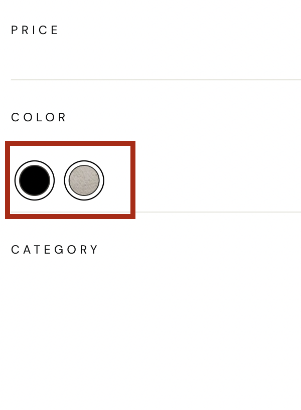
The usual facet item be customized by adding customized template to facetItemTemplate. If the customer’s requirement is to have a facet item as a swatch , below code snippet can be referred.
facetItemTemplate by default has some behaviour which can be overriden .
facet: {
    // ..Other facet configurations goes here
    facetItemTemplate: function facetItemTemplate(facet, value,facetSearchTxt) {
        var facetName = facet.facetName,
        isSelected = facet.isSelected;
        var name = value.name,
            count = value.count,
            dataId = value.dataId;
        var _this$options$facet = this.options.facet,
            facetClass = _this$options$facet.facetClass,
            selectedFacetClass = _this$options$facet.selectedFacetClass;
        var UNX_uFilter = this.testIds.UNX_uFilter;
            if(facetSearchTxt && facetSearchTxt.length > 0) {
                if(name.toUpperCase().indexOf(facetSearchTxt.toUpperCase()) < 0 ){
                    facetClass +=' UNX-search-hidden'
                }
            }
            let action =  "changeFacet";
            if(isSelected) {
                facetClass += ` ${selectedFacetClass}`
                action = "deleteFacetValue";
            }
            if(facetName === 'colorTags_uFilter') {
                var cName = name.toLowerCase();
                var fName = cName.replace(" ", "-");
                var facetNames = "https://cdn.shopify.com/s/files/1/0727/7773/t/57/assets/".concat(fName+"_50x.png");
                return [`<button data-test-id="${UNX_uFilter}" data-facet-name="${facetName}" data-facet-action="${action}" class="UNX-change-facet UNX-color-facet ${facetClass}" data-id="${dataId}">`,
                `<span class="UNX-color-swatch">${name}</span><span class="UNX-facet-text color-swatch color-swatch--filter color-swatch" style="background-image: url(`+`${facetNames}`+`); background-color: ${fName};"></span></button>`].join('');
            } else if (facetName === 'brand_uFilter') {
                return [`<div title="${dataId ? dataId : 'None'}" data-test-id="${UNX_uFilter}" data-facet-name="${facetName}" data-facet-action="${action}" class="UNX-change-facet ${facetClass} " data-id="${dataId}">`,
                `<span class="UNX-brand ${facetClass}" type="checkbox"></span><div class="UNX-facet-text">${name}</div><span class="UNX-facet-count">(${count})</span></div>`].join('');
            } else {
                return [`<button title="${dataId ? dataId : 'None'}" data-test-id="${UNX_uFilter}" data-facet-name="${facetName}" data-facet-action="${action}" class="UNX-change-facet ${facetClass} " data-id="${dataId}">`,
                `<span class="UNX-facet-text">${name}</span></button>`].join('');
            }
        },

}
Usecase 6: Facet item with swatches in the name
User Requirement
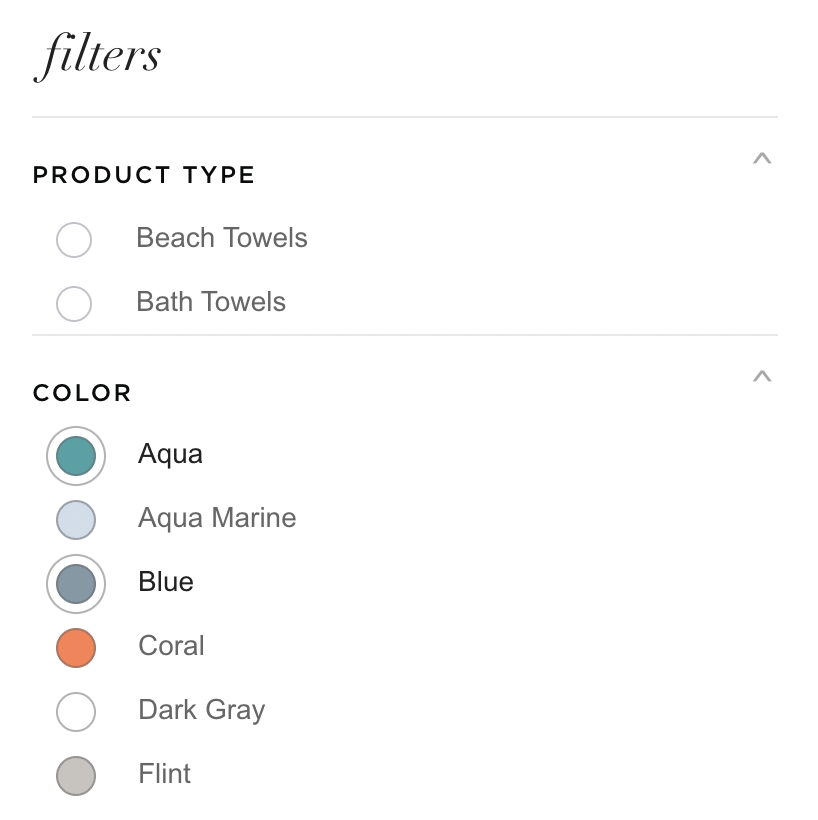
If the customer needs to customize facet items such that the facet item name should have a colored/plane swatch/button next to it. Below customization shows adding code in facetItemTemplate to have colored swatch button with facet name for color facet and for rest facet item a plane circular button.
facet: {
    // ..Other facet configurations goes here
    facetItemTemplate: function facetItemTemplate(facet, value, facetSearchTxt) {
        const {
                facetName,
                isSelected
            } = facet;
            const  {
                name,
                count,
                dataId
            } = value;
            let {
                facetClass,
                selectedFacetClass
            } = this.options.facet;
            const {
                UNX_uFilter
            } = this.testIds;
            if(facetSearchTxt && facetSearchTxt.length > 0) {
                if(name.toUpperCase().indexOf(facetSearchTxt.toUpperCase()) < 0 ){
                    facetClass +=' UNX-search-hidden'
                }
            }
            let action =  "changeFacet";
            if(isSelected) {
                facetClass += ` ${selectedFacetClass}`
                action = "deleteFacetValue";
            }

            return [`<button data-test-id="${UNX_uFilter}" data-facet-name="${facetName}" data-facet-action="${action}" class="UNX-change-facet ${facetClass}" data-id="${dataId}">`,
                `<span class="UNX-facet-text">${name}</span> <span class="UNX-facet-count">(${count})</span>`,
            `</button>`].join('')
}
}
Usecase 7: Customized facet block
User Requirement
If a Customer needs to customize the block of facets (where all the facets are listed) , they need to add the custom code in facetTemplate . facetTemplate by default has some code (by default behaviour) as defined in this section which can be overriden . One such customization is shown in below integration (refer the code snippet)
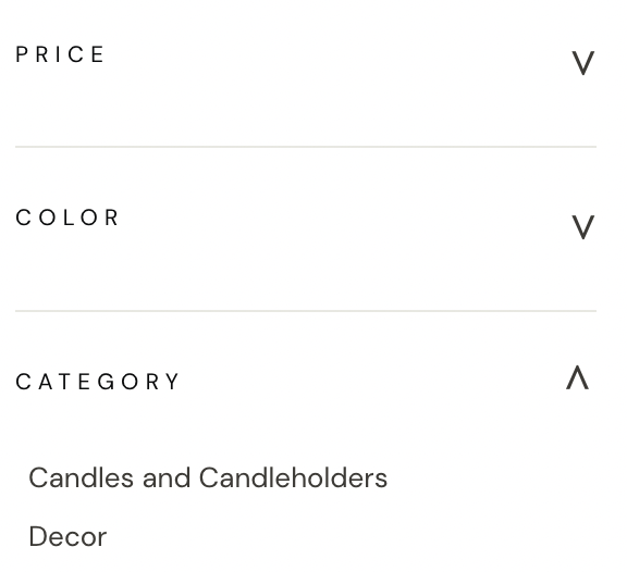
facet{
    //Rest configs for facet
    facetTemplate: function facetTemplate(facetObj, children, isExpanded, facetSearchTxt, facet) {
            var displayName = facetObj.displayName,
                facetName = facetObj.facetName,
                multiLevelField = facetObj.multiLevelField,
                facetType = facetObj.facetType,
                values = facetObj.values;
            var facetClass = facet.facetClass,
                applyMultipleFilters = facet.applyMultipleFilters,
                isCollapsible = facet.isCollapsible,
                isSearchable = facet.isSearchable,
                searchPlaceHolder = facet.searchPlaceHolder,
                textFacetWrapper = facet.textFacetWrapper,
                enableViewMore = facet.enableViewMore,
                viewMoreText = facet.viewMoreText,
                viewMoreLimit = facet.viewMoreLimit,
                applyButtonText = facet.applyButtonText,
                clearButtonText = facet.clearButtonText;
            var _this$options = this.options,
                actionBtnClass = _this$options.actionBtnClass,
                actionChangeClass = _this$options.actionChangeClass;
            var _this$cssList = this.cssList,
                openBtn = _this$cssList.openBtn,
                closeBtn = _this$cssList.closeBtn;
            var viewMoreUi = "";
            var viewMoreCss = "";
            var selected = this.getSelectedFacets()[facetName];
            var isFtr = selected && selected.length > 0 ? true : false;
            if (enableViewMore && facetType === "text" && values.length > viewMoreLimit) {
                viewMoreCss = "UNX-view-more";
                viewMoreUi = "<div class=\"UNX-view-more-row \"><button class=\"".concat(actionBtnClass, "\" data-facet-name=\"").concat(facetName, "\" data-action=\"viewMore\" data-id=\"").concat(viewMoreText[0], "\">").concat(viewMoreText[0], "</button></div>");
            }
            var clearUI = "";
            var applyBtn = "";
            if (isFtr) {
                clearUI = "<button class=\"UNX-facet-clear ".concat(facetClass, " \"data-facet-action=\"deleteFacet\" data-facet-name=\"").concat(facetName, "\">").concat(clearButtonText, "</button>");
            }
            if (applyMultipleFilters && isFtr) {
                applyBtn = "<button class=\"UNX-facet-primary ".concat(facetClass, " \"data-facet-action=\"applyFacets\" >").concat(applyButtonText, "</button>");
            }
            var collapsibleUI = "";
            var searchInput = "";
            if (isCollapsible) {
                if (isExpanded) {
                    collapsibleUI = "<div class=\"UNX-facet-header ".concat(actionBtnClass, " UNX-facet-open\"  data-facet-name=\"").concat(facetName, "\" data-facet-action=\"facetClose\"> <h3>").concat(displayName, "</h3></div>");
                } else {
                    collapsibleUI = "<div class=\"UNX-facet-header ".concat(actionBtnClass, " UNX-facet-close\"  data-facet-name=\"").concat(facetName, "\" data-facet-action=\"facetOpen\"> <h3>").concat(displayName, "</h3></div>");
                }
            }
            if (isSearchable && facetSearchTxt !== null) {
            searchInput = "<div class=\"UNX-searchable-facets\"><input data-test-id=\"".concat(this.testIds.UNX_searchFacets, "\" class=\"UNX-facet-search ").concat(actionChangeClass, "\" value=\"").concat(facetSearchTxt, "\"  data-facet-name=\"").concat(facetName, "\" data-facet-action=\"searchFacets\" type=\"text\" placeholder=\"").concat(searchPlaceHolder, "\"/></div>");
            }
            return ["<div class=\"UNX-text-facet-wrap\" style=\"border-top: unset !important\"; \"border-top-color: unset !important\" >",
            collapsibleUI,
            "<div class=\"UNX-facets-all\">",  "<div class=\"UNX-facets ".concat(textFacetWrapper, " ").concat(viewMoreCss, "\">").concat(children, "</div>"), "</div>", "</div>"].join('');
        }
}
Usecase 8: Customized selected facets
User Requirement
The Usual behaviour of selected facet tags can be customized by adding the code in selectedFacetItemTemplate.
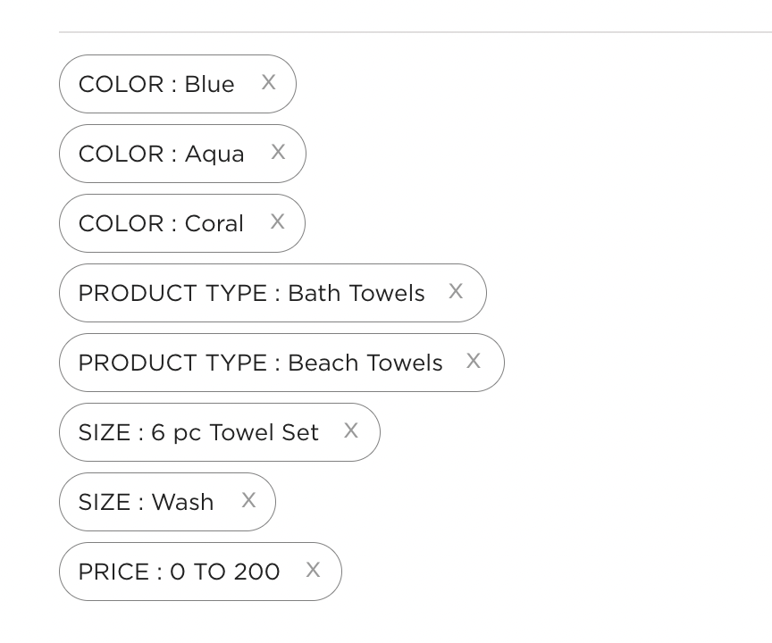
facet:{
    //Rest configs for facet
    selectedFacetItemTemplate: function(selectedFacet, selectedFacetItem, facetConfig, selectedFacetsConfig) {
        var facetName = selectedFacet.facetName,
            facetType = selectedFacet.facetType;
        var name = selectedFacetItem.name,
            count = selectedFacetItem.count,
            dataId = selectedFacetItem.dataId;
        var _this$options$facet = this.options.facet,
            facetClass = _this$options$facet.facetClass,
            selectedFacetClass = _this$options$facet.selectedFacetClass,
            removeFacetsSelectorClass = _this$options$facet.removeFacetsSelectorClass;
        var UNX_uFilter = this.testIds.UNX_uFilter;
        var action = "deleteSelectedFacetValue";
        if (facetType === "range") {
            action = "deleteSelectedRange";
        }
        var css = " ".concat(facetClass, " ").concat(selectedFacetClass, " ");
        if(facetName === "v_Variant_Price"){
        return ["<li class=\"UNX-selected-facets-wrap\">",
        "<a data-test-id=\"".concat(UNX_uFilter, "\" class=\"UNX-change-facet").concat(css, "\" data-facet-name=\"").concat(facetName, "\" data-facet-action=\"").concat(action, "\" data-id=\"").concat(dataId, "\">"),
        "<span class=\"UNX-delete-facet-text \">".concat('PRICE : ', name,"</span></a>"),
        "<a class=\"UNX-delete-facet ".concat(removeFacetsSelectorClass, "").concat(css, "\" data-id=\"").concat(dataId, "\" data-facet-action=\"").concat(action, "\" data-facet-name=\"").concat(facetName, "\">x</a>"),"</li>"
        ].join('');
        }
        if(facetName === "v_color_uFilter") {
            return ["<li class=\"UNX-selected-facets-wrap\">",
        "<a data-test-id=\"".concat(UNX_uFilter, "\" class=\"UNX-change-facet").concat(css, "\" data-facet-name=\"").concat(facetName, "\" data-facet-action=\"").concat(action, "\" data-id=\"").concat(dataId, "\">"),
        "<span class=\"UNX-delete-facet-text \">".concat('COLOR : ', name,"</span></a>"),
        "<a class=\"UNX-delete-facet ".concat(removeFacetsSelectorClass, "").concat(css, "\" data-id=\"").concat(dataId, "\" data-facet-action=\"").concat(action, "\" data-facet-name=\"").concat(facetName, "\">x</a>"),"</li>"
        ].join('');
        }
        if(facetName === "v_size_uFilter") {
            return ["<li class=\"UNX-selected-facets-wrap\">",
        "<a data-test-id=\"".concat(UNX_uFilter, "\" class=\"UNX-change-facet").concat(css, "\" data-facet-name=\"").concat(facetName, "\" data-facet-action=\"").concat(action, "\" data-id=\"").concat(dataId, "\">"),
        "<span class=\"UNX-delete-facet-text \">".concat('SIZE : ', name,"</span></a>"),
        "<a class=\"UNX-delete-facet ".concat(removeFacetsSelectorClass, "").concat(css, "\" data-id=\"").concat(dataId, "\" data-facet-action=\"").concat(action, "\" data-facet-name=\"").concat(facetName, "\">x</a>"),"</li>"
        ].join('');
        }
        if(facetName === "categoryPath1_uFilter") {
            return ["<li class=\"UNX-selected-facets-wrap\">",
        "<a data-test-id=\"".concat(UNX_uFilter, "\" class=\"UNX-change-facet").concat(css, "\" data-facet-name=\"").concat(facetName, "\" data-facet-action=\"").concat(action, "\" data-id=\"").concat(dataId, "\">"),
        "<span class=\"UNX-delete-facet-text \">".concat('PRODUCT TYPE : ', name,"</span></a>"),
        "<a class=\"UNX-delete-facet ".concat(removeFacetsSelectorClass, "").concat(css, "\" data-id=\"").concat(dataId, "\" data-facet-action=\"").concat(action, "\" data-facet-name=\"").concat(facetName, "\">x</a>"),"</li>"
        ].join('');
        }

    }
}
FAQs
- How to enable and make use of the faceted search functionality provided by the SDK?
- What are facets and how do they work with the Unbxd Search SDK?
- How can I customize the facets that are displayed on my website?
- Can I limit the number of facets that are displayed to the user?
- How does the Unbxd Search SDK handle multi-select facets?
- Can I track the performance of my facets?
