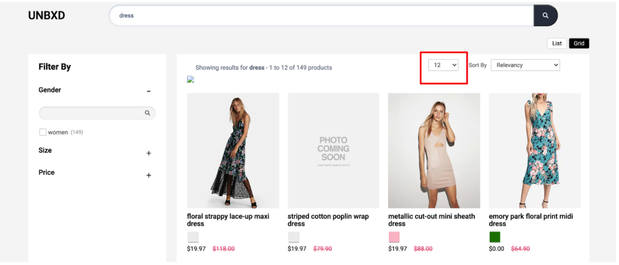
Page Size
Table of contents
Definition
In e-commerce, “page size” refers to the number of products that are displayed on a single page of search results or product listings. It allows users to control how many items they see at a time, by giving them the option to choose from different page sizes such as 10, 20, 50 or 100 items per page.
The purpose of this feature is to help users quickly find and view the products they are interested in, without having to scroll through an excessive number of items. It can also improve the overall user experience by making it easier to scan and compare products. Additionally, for some e-commerce website, the page size concept can help to improve site performance and loading time.
Some e-commerce websites also provide pagination options so that users can navigate through the pages of search results or product listings by clicking on page numbers or next/previous buttons.
Behavior
Page Size widget allows you to configure the number of products shown on each page. The value should be greater than ZERO. It is suggested that the value to be multiple of number of columns (ex. if gridCount is 3 then 15 or 18 or 21).
Configurations
To render the Page Size widget, you need to configure the “pageSize” config object.
pagesize: {
    //Below configurations should be added here.
}
The following are the various options available under the object:
enabled
Boolean
“Enabled” is a flag or switch that allows developers to turn on or off a page size component in an e-commerce website. In this context, the “page size” refers to the ability to display a dropdown with different page sizes on the website.
When the “enabled” flag is turned ON, the page size will be active and different pagesizes will be displayed on the website. This can be used to have different number of products on a page. When the “enabled” flag is turned OFF, the banner feature will be disabled and no banners or advertisements will be displayed on the website.
Turn this off if you do not want the page size component.
Default Value
enabled: true
Scenarios
true: Page size component will be visible.false: Page size component will not be visible on the webpage .
el
Element
The “element” option for pageSize refers to the HTML element that is used to create the page size component. This option allows the developer to specify what type of HTML element should be used for the same.
Default Value
el: null
Scenarios
There are several HTML selectors that can be used to locate the banner element in an e-commerce page. For ex: getElementById, getElementsByClassName, getElementsByTagName, querySelector, querySelectorAll, getElementsByName, etc.
pageSize
Number
This option would allows to set the number of items per page to be displayed.
Default Value
pageSize: 12
Scenarios
Any positive integer page size can be given .
options
Array
Array of desired page sizes to be rendered. It is suggested that the value be a multiple of number of columns (ex. if 3 columns then 15 or 18 or 21).
Default Value
options: [8, 12, 16, 20, 24]
Scenarios
Any array of integers could be made as options.
pageSizeClass
String
Additional CSS class name to be added to the page size element.
Default Value
pageSizeClass: “UNX-pagesize”
Scenarios
Any valid class name can be added as pageSizeClass.
selectedPageSizeClass
String
Additional CSS class name to be added to the selected page size option.
Default Value
selectedPageSizeClass: “UNX-selected-pagesize”
Scenarios
Any valid class name can be added as selectedPageSizeClass.
action
String
Action on which page size change should trigger.
Default Value
action: “change”
Scenarios
click:change:
template
Function
The “template” function here refers to the ability to change the look and feel of the pageSize component . This function expects 2 parameters:
selected: the page size that is selected.pagesize: the page size config (i.e. this complete object).
Expected return value : The function is expected to return html String.
Default Value
template: function(selected, pagesize) {
    const {
        UNX_pagesize
    } = this.testIds;
    let ui = `<label class="UNX-hidden" for="unxPageSize">Sort By</label><select id="unxPageSize" name="unxPageSize" class="UNX-select-pagesize ${pagesize.pageSizeClass}">`;
    pagesize.options.forEach((opt,i)=>{
        const tId = `data-test-id="${UNX_pagesize}${i+1}"`;
        if(selected == opt) {
            ui+=`<option selected ${tId} class="${pagesize.selectedPageSizeClass}" id="${opt}">${opt}</option>`;
        } else{
            ui+=`<option ${tId} id="${opt}">${opt}</option>`;
        }

    });
    ui+= `</select>`
    return `<div class="UNX-pagesize-block">${ui}</div>`;
}
Scenarios
For additional information on custom scenarios, please refer to the use cases section located below.
tagName
String
“tagName” refers to the name of an HTML tag used to wrap or structure the content on a webpage.
Default Value
tagName: “div”
Scenarios
Any valid html tag such as div, span, p, h1, h2, etc in which you like the banner code to be wrapped in.
htmlAttributes
Object
“htmlAttributes” refers to a set of key-value pairs that provide additional information or properties for an HTML element. By default it contains classes for the wrapper. You can add more classes or any valid attributes.
Default Value
htmlAttributes : { class:”UNX-selected-pagesize” }
Scenarios
Any valid html attribute can be passed as key : value pairs inside an object.
Default Example
Sample code for “pageSize” config:
pageSize: {
    enabled:true,
       pageSize:12,
       options:[8,12,16,20,24],
       pageSizeClass:"UNX-pagesize",
       selectedPageSizeClass:"UNX-selected-pagesize",
       action:'change',
       el:null,
       template:function(selected, pagesize) {
        const {
            UNX_pagesize
        } = this.testIds;
        let ui = `<select  class="UNX-select-pagesize ${pagesize.pageSizeClass}">`;
        pagesize.options.forEach((opt,i)=>{
            const tId = `data-test-id="${UNX_pagesize}${i+1}"`;
            if(selected == opt) {
                ui+=`<option selected ${tId} class="${pagesize.selectedPageSizeClass}" id="${opt}">${opt}</option>`;
            } else{
                ui+=`<option ${tId} id="${opt}">${opt}</option>`;
            }

        });
        ui+= `</select>`
        return `<div class="UNX-pagesize-block">${ui}</div>`;
    },
   }
